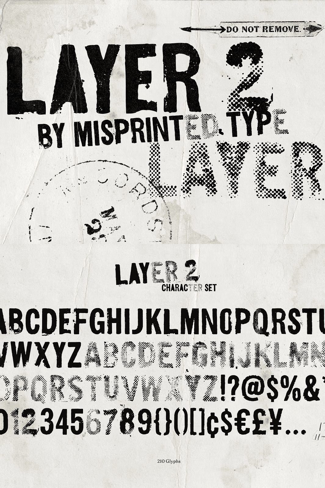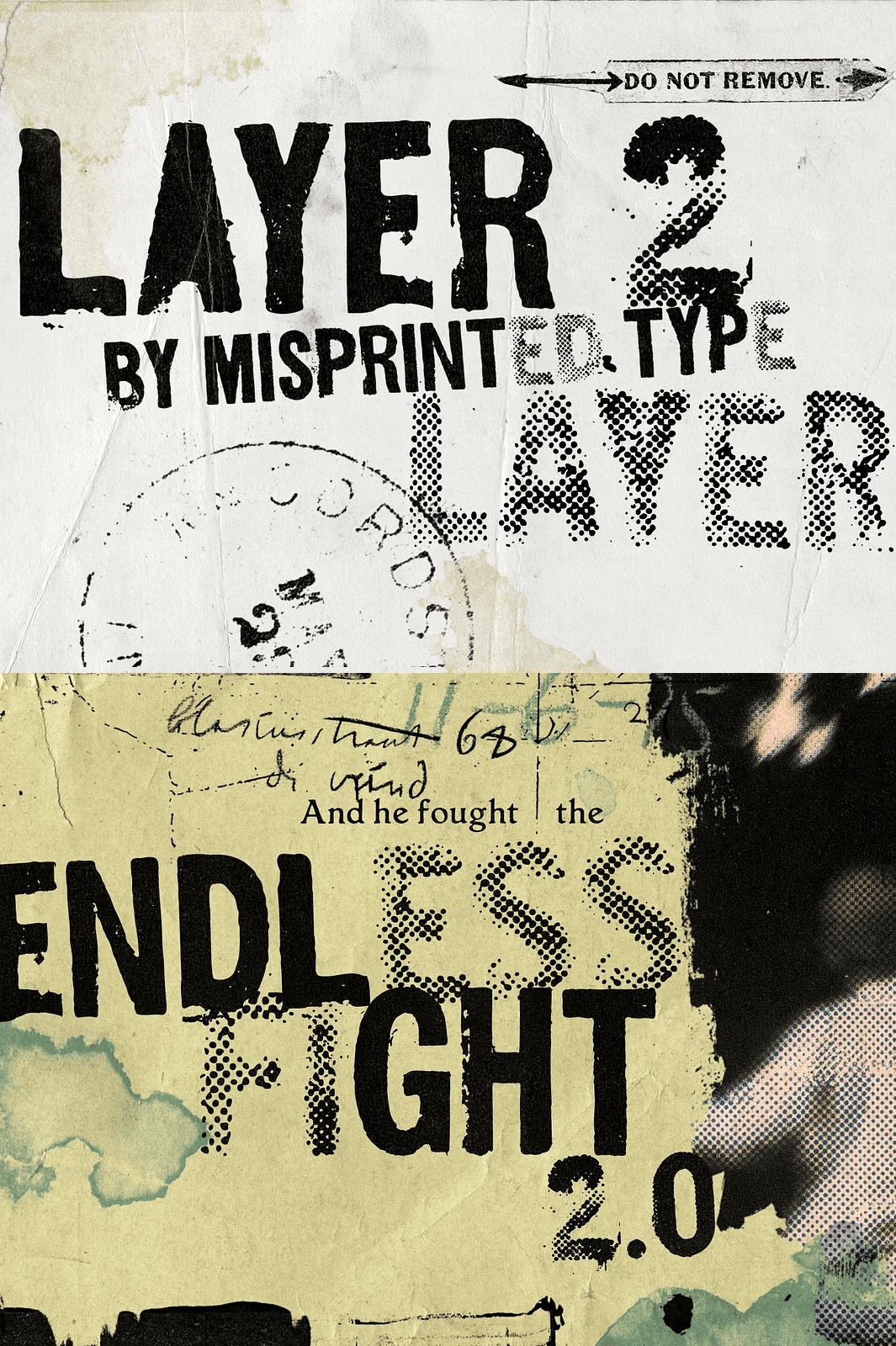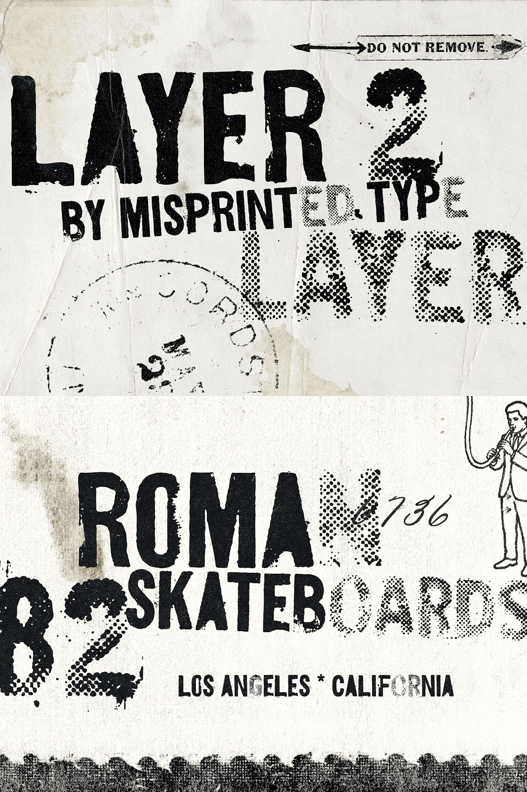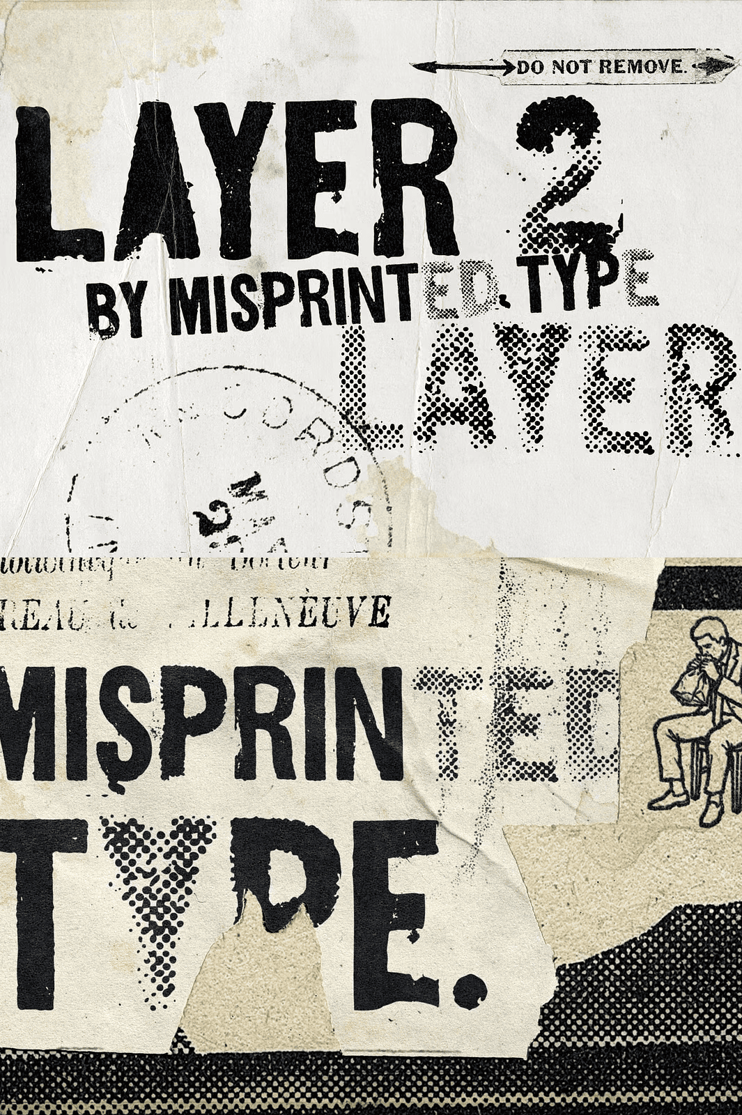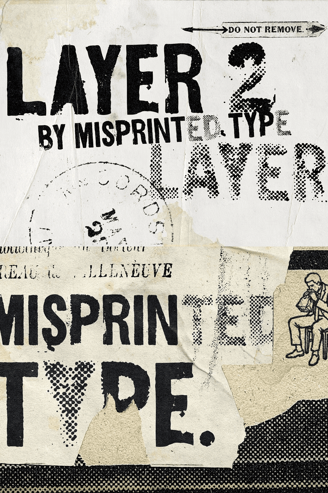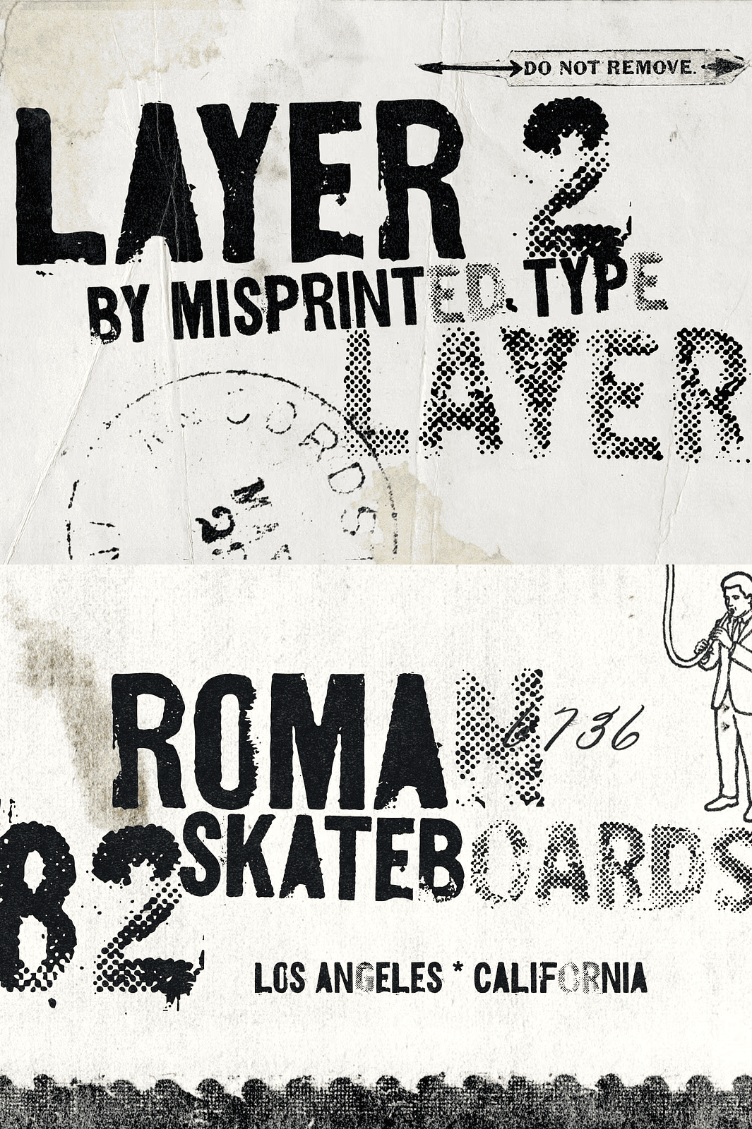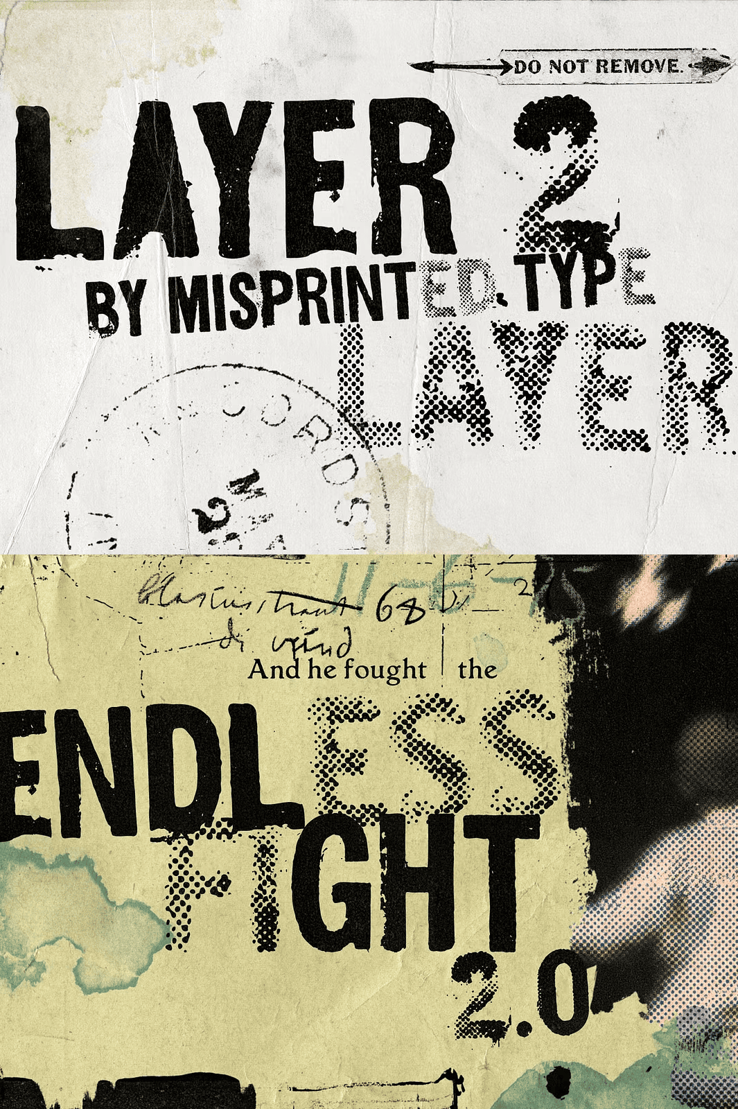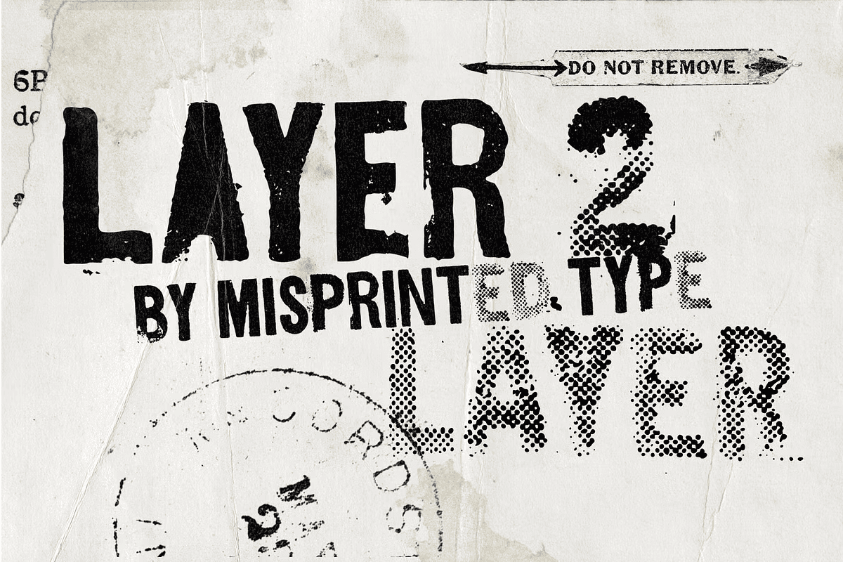

Layer 2 is a distressed display typeface inspired by the rebellious spirit of the 90s grunge movement, a time when designers embraced imperfection and rejected the polished aesthetics of traditional graphic design. Drawing from vintage screen printing, worn photocopies, clogged halftones, and over-inked prints, Layer 2 transforms printing flaws into expressive letterforms full of texture, attitude, and personality.
Whether you design posters, album covers, magazines, apparel, or branding, this font captures the raw energy of 90s grunge and the beauty of imperfect printmaking.
Why Distressed Grunge Fonts Work for Bold Design
Grunge design rejects polish and perfection. It celebrates chaos, texture, and raw expression. As a result, distressed fonts instantly communicate attitude and authenticity.
Moreover, the print-inspired imperfections recall the tactile quality of analog production. In addition, the worn details add depth that clean digital fonts cannot match. Consequently, Layer 2 delivers the unapologetic edge your design needs.
Two Distinct Uppercase Alphabets
The font includes two uppercase alphabets with distinct personalities. The first features heavily distressed characters, while the second recreates the look of clogged halftones, as if a screen print had gone wrong during production.
Mixing both styles together creates an unpredictable rhythm and a layered grunge aesthetic that feels raw, authentic, and impossible to recreate with simple textures. As a result, your typography gains a genuinely handcrafted quality.
What Is Included in Layer 2
- Two uppercase alphabets with distinct distressed personalities
- 210 glyphs for plenty of creative freedom
- Handmade grunge spirit preserved in every character
The extensive glyph count gives you remarkable creative flexibility. In addition, the variety of distressed letterforms lets you avoid repetition and build truly custom-looking typography. Consequently, your designs stand out from anything created with standard fonts.
Perfect Uses for Layer 2
- Posters and large-format prints
- Album covers and music artwork
- Magazines and editorial layouts
- Apparel and streetwear graphics
- Branding and identity systems
- Zines and independent publications
- Social media graphics and campaigns
- Event promotions and gig flyers
- Sticker design and merchandise
- Creative and experimental projects
Whether you design for clients or create personal projects, this typeface brings raw energy and attitude to every composition.
Why Imperfection Adds Value in Typography
Perfectly uniform fonts often feel sterile and impersonal. The intentional flaws in Layer 2 mimic the natural variation of vintage printing. As a result, your designs feel genuinely crafted rather than machine-generated.
In addition, the distressed textures add depth and visual interest to headlines and logos. Consequently, your work stands out in crowded marketplaces.
How to Use Layer 2 in Your Projects
Start by applying the font to headlines, logos, and key design elements. Next, experiment with mixing both alphabets to create dynamic typographic contrast. Then adjust spacing and scale to balance the distressed letterforms within your layout.
For posters and album covers, let the grunge textures take center stage. For branding and apparel, use the font for expressive slogans and graphics. Because the typeface remains legible at large sizes, it performs beautifully across every application.
Download the Layer 2 Distressed Display Font Today
Layer 2 combines two grunge alphabets, 210 glyphs, and print-inspired texture in one distinctive font package. It gives designers, bands, and streetwear brands everything needed to create raw, authentic typography.
Download this distressed grunge display typeface today and bring vintage screen printing, clogged halftones, and 90s rebellion to your posters, album covers, magazines, apparel, and branding projects.