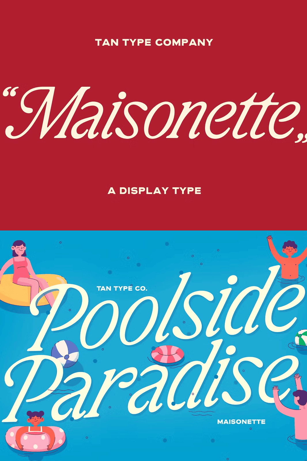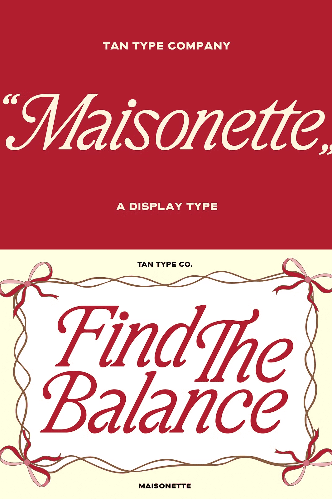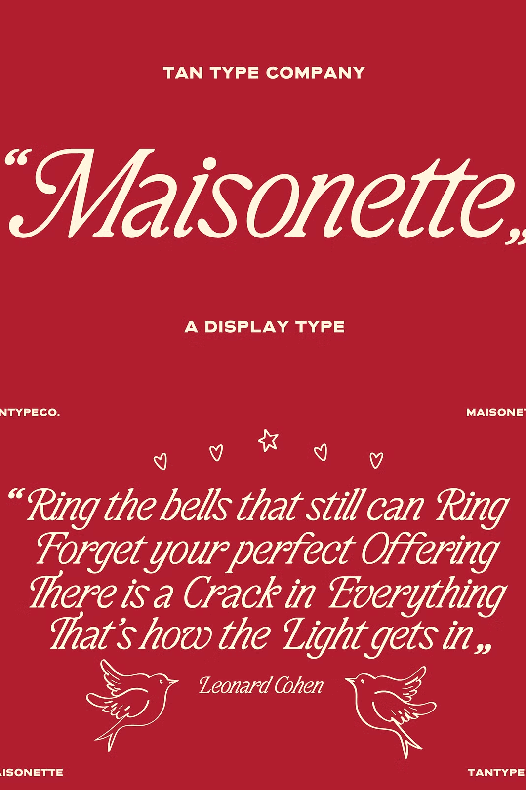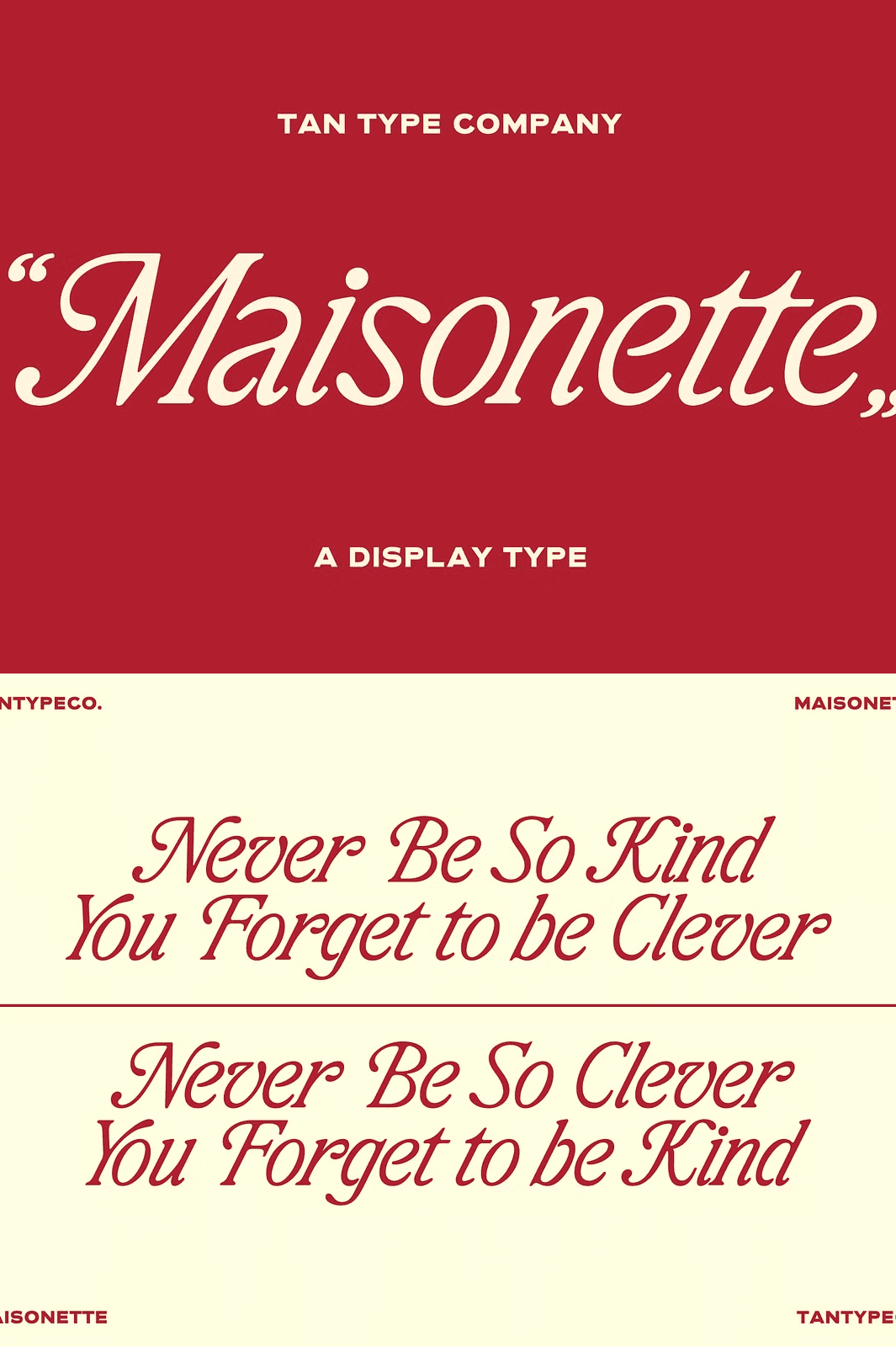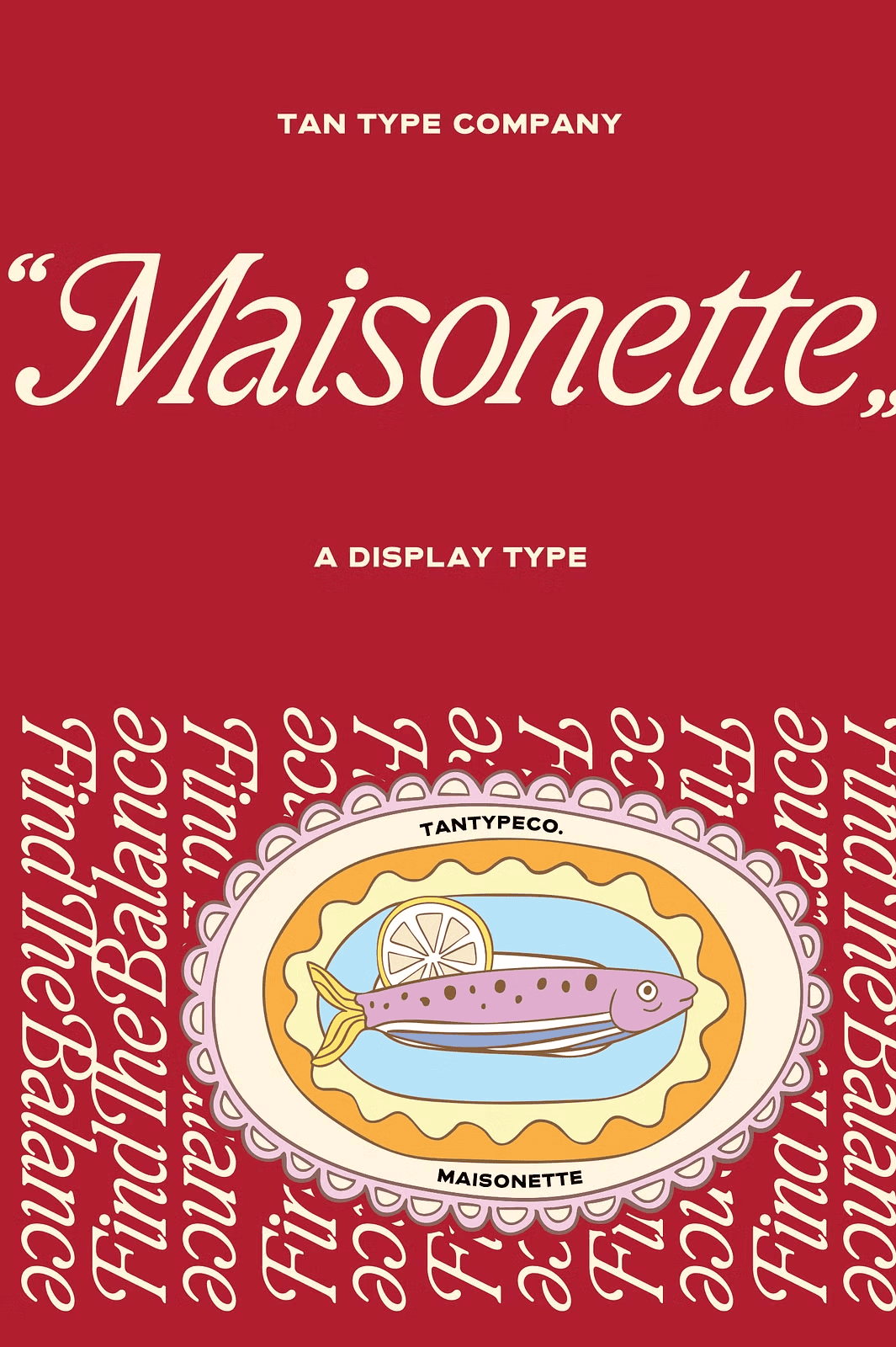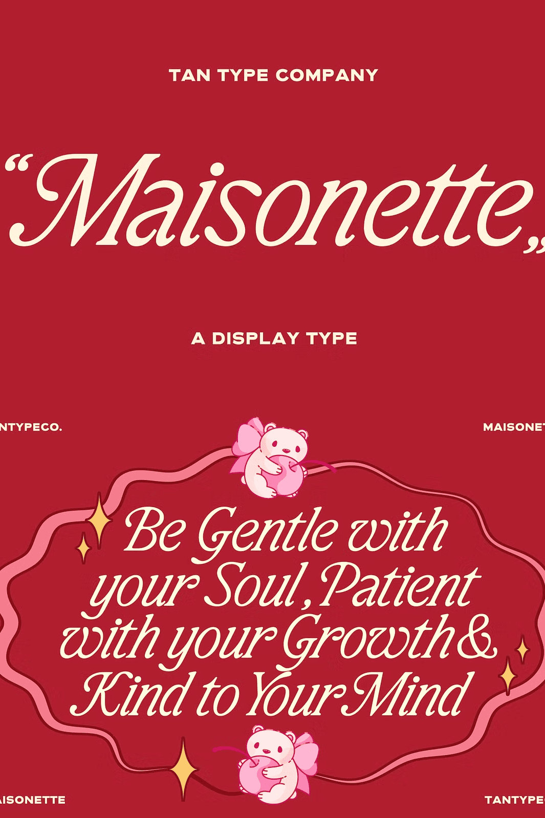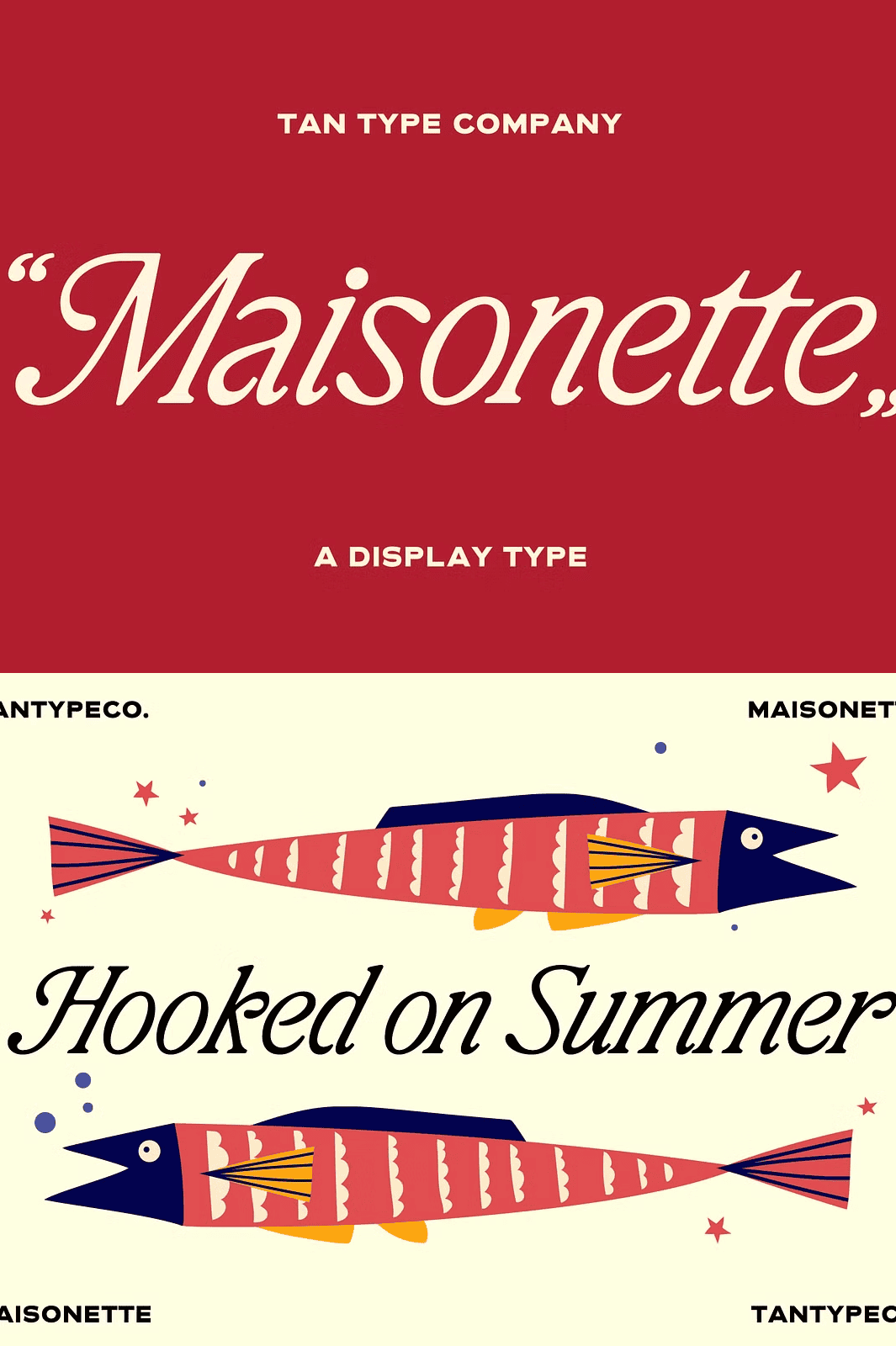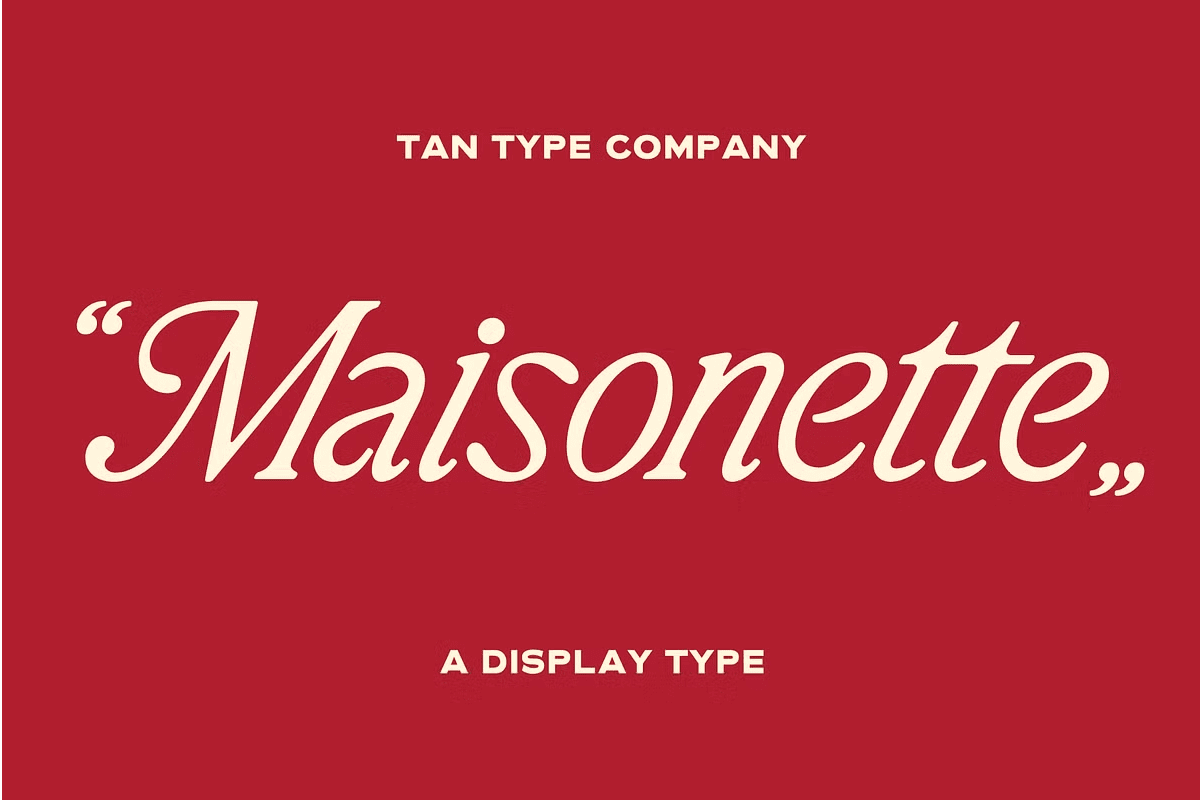

TAN-Maisonette is a high-contrast serif inspired by vintage book typography, classic editorial design, and the quiet charm of old printed ephemera. Combining crisp serifs with soft, flowing curves, Maisonette feels elegant without becoming overly formal.
Its distinctive italic style adds movement and personality, bringing a romantic and literary character that feels equally at home in both contemporary and vintage-inspired projects.
Why TAN-Maisonette Stands Out Among Editorial Serifs
Editorial serifs must balance beauty with readability, and Maisonette achieves both with remarkable grace. The high-contrast strokes create dramatic visual impact in headlines, while the carefully proportioned letterforms keep extended text comfortable to read. As a result, one typeface handles every typographic role in a layout.
Moreover, the vintage book influence gives the font a literary warmth that modern geometric serifs often lack. In addition, the flowing curves soften the crisp serifs, creating a balance between structure and elegance. Consequently, your designs feel refined, nostalgic, and quietly sophisticated.
The Inspiration Behind This Vintage Serif Font
Drawing inspiration from old novels, handwritten notes, and European print design, Maisonette was created for designers looking to add warmth, refinement, and a touch of nostalgia to their work.
Whether used for branding, packaging, book covers, wedding stationery, editorial layouts, or social media graphics, it offers a timeless voice with plenty of character. Beautiful in large headlines yet versatile enough for a wide range of creative applications, Maisonette brings a sense of grace, charm, and storytelling to every page.
Perfect Uses for This Literary Serif Typeface
- Branding and identity systems
- Editorial design and magazine layouts
- Packaging and product labels
- Wedding invitations and stationery
- Book covers and title pages
- Beauty products and cosmetics branding
- Logos and brand marks
- Social media graphics and quotes
- Posters and promotional materials
- Greeting cards and personal projects
Whether you design for clients or create personal work, this font brings elegance and storytelling to every composition. Furthermore, the italic style adds expressive movement for quotes, captions, and accent words.
Why High-Contrast Serifs Work in Modern Design
High-contrast serifs create visual drama that flat typefaces cannot match. The interplay of thick and thin strokes draws the eye and establishes hierarchy instantly. As a result, headlines command attention while remaining elegant.
In addition, this style carries historical weight that resonates with audiences seeking authenticity. Whether paired with minimal layouts or rich decorative elements, high-contrast serifs elevate the overall design experience. Consequently, TAN-Maisonette suits both traditional and contemporary aesthetics.
How to Use TAN-Maisonette in Your Projects
Start by using the regular style for headlines, subheadings, and body text. Next, introduce the italic for emphasis, quotes, and dynamic accents. Then adjust tracking and leading to fine-tune the editorial feel of your layout.
For branding projects, pair Maisonette with clean sans serif fonts for supporting text. For wedding stationery and book covers, let the serif take center stage. Because the letterforms remain legible at all sizes, you gain remarkable typographic flexibility.
Download the TAN-Maisonette Serif Font Today
TAN-Maisonette combines high-contrast serifs, soft flowing curves, a distinctive italic style, and literary charm in one refined font package. It gives designers, publishers, and brands everything needed to create warm, elegant, and timeless typography.
Download this vintage-inspired serif font today and bring grace, charm, and storytelling to your branding, editorial layouts, book covers, packaging, and wedding stationery.