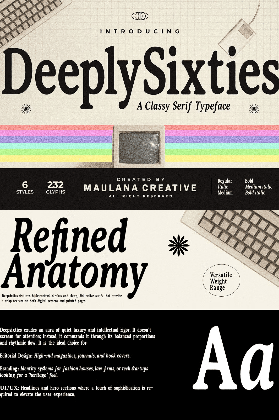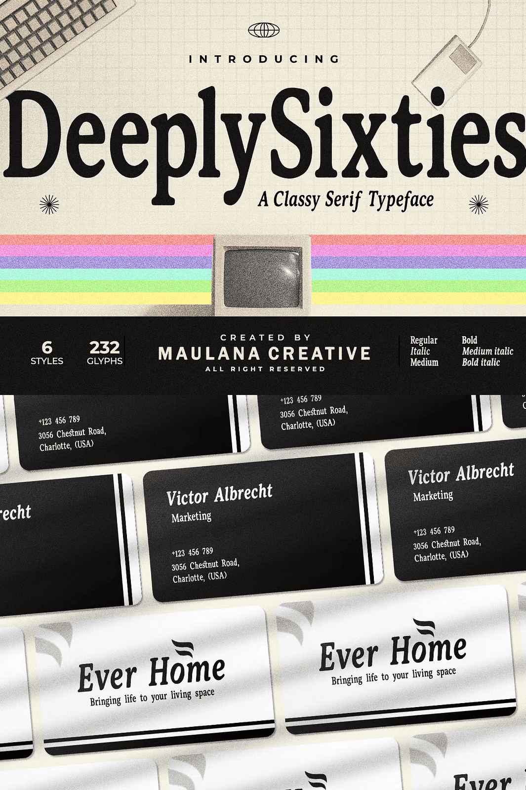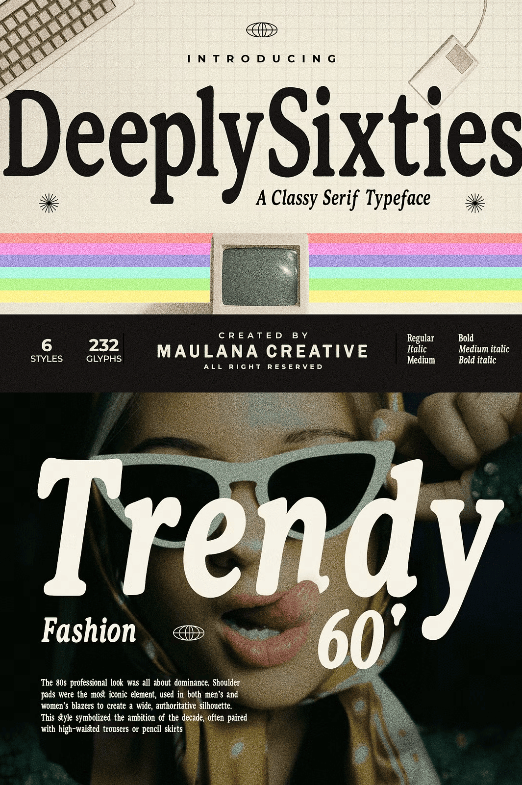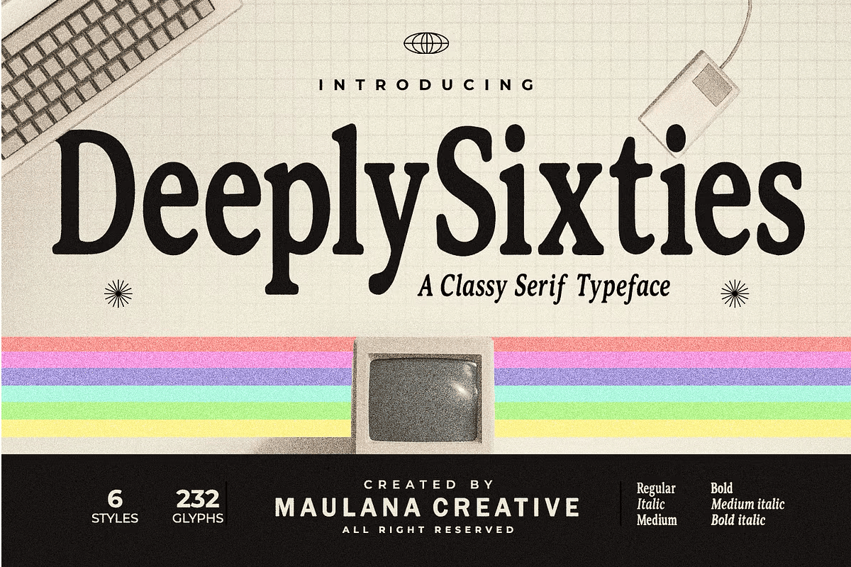

DeeplySixties is an elegant serif typeface inspired by the classic aesthetic of the 1960s. Featuring high-contrast strokes and sharp, distinctive serifs, this font provides a crisp texture on both digital screens and physical pages.
It exudes an aura of quiet luxury, balanced proportions, and rhythmic flow, making it command attention naturally.
Why DeeplySixties Stands Out Among Retro Serif Fonts
Retro serifs often lean too heavily into nostalgia. DeeplySixties takes a different path. It channels the sophistication of 1960s editorial design while remaining thoroughly modern in construction. As a result, the font feels both timeless and contemporary.
Moreover, the high-contrast strokes create dramatic visual rhythm across every line of text. In addition, the sharp, distinctive serifs add intellectual rigor and heritage appeal. Consequently, the typeface suits luxury branding, editorial spreads, and premium digital interfaces with equal strength.
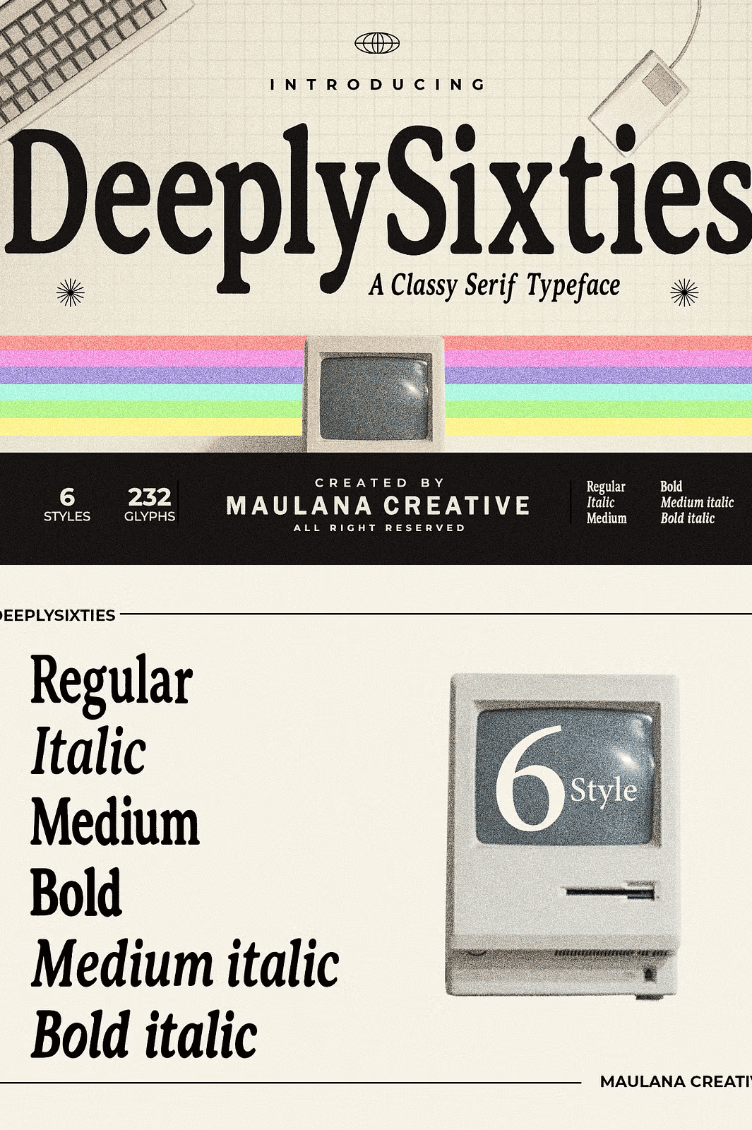
Six Versatile Styles in One Font Family
With 6 versatile styles ranging from Regular to Bold Italic, DeeplySixties gives you complete typographic control. You can build clear hierarchy within a single layout, moving from delicate body text to commanding headlines without switching fonts.
The italic styles add expressive movement for quotes, captions, and accent words. Meanwhile, the bold weights anchor headlines and hero sections with quiet authority. As a result, one family supports an entire design system.
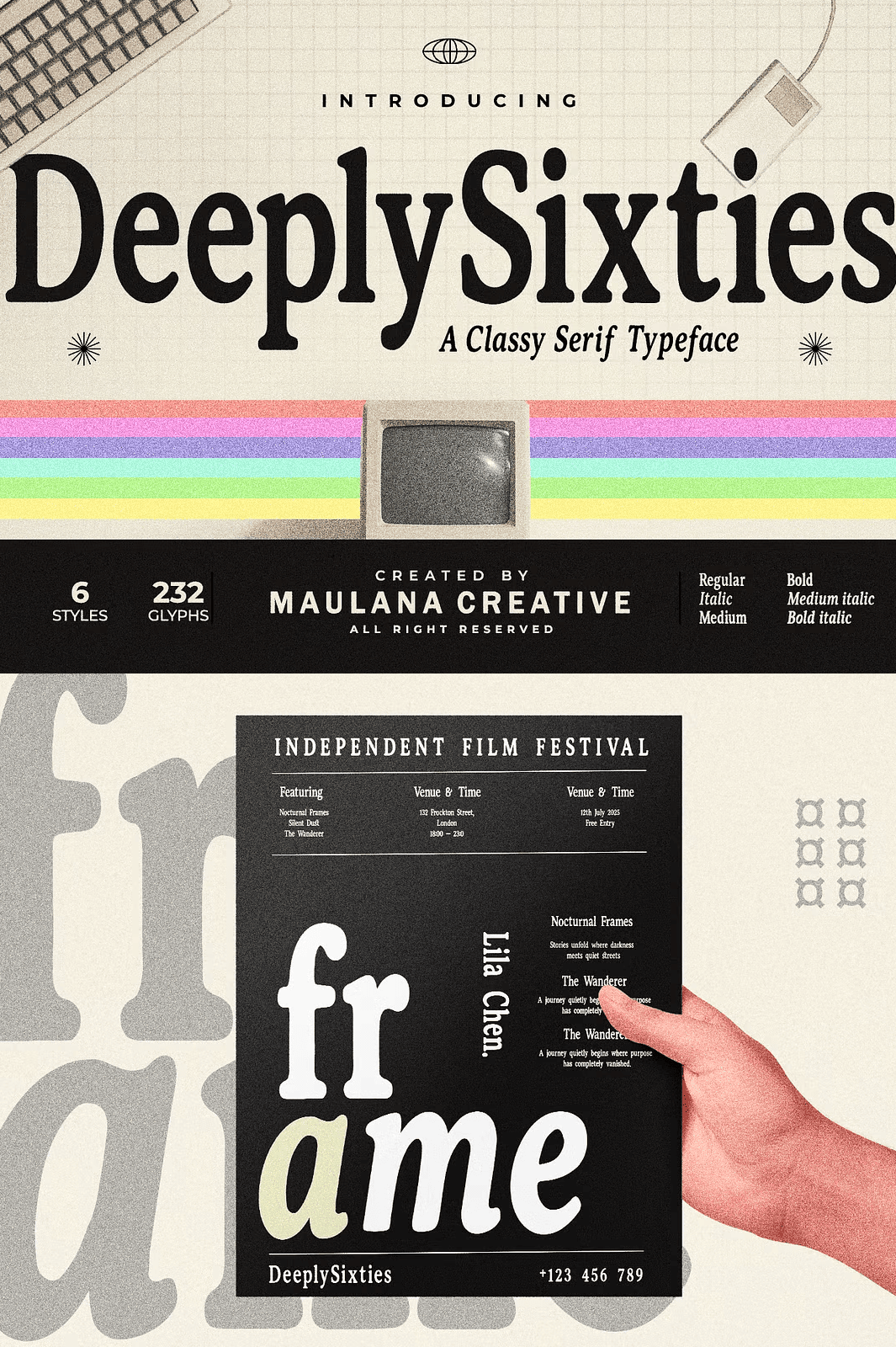
Perfect Uses for This 1960s-Inspired Serif
- Editorial designs and magazine layouts
- High-end journals and publications
- Book covers and title pages
- Sophisticated brand identity systems
- Digital interfaces and app headers
- Website hero sections
- Luxury packaging and product labels
- Posters and promotional materials
Whether you design for print or digital platforms, DeeplySixties elevates the overall experience with a touch of timeless heritage. Furthermore, its balanced proportions keep long text comfortable to read.
What Is Included in the DeeplySixties Font Family
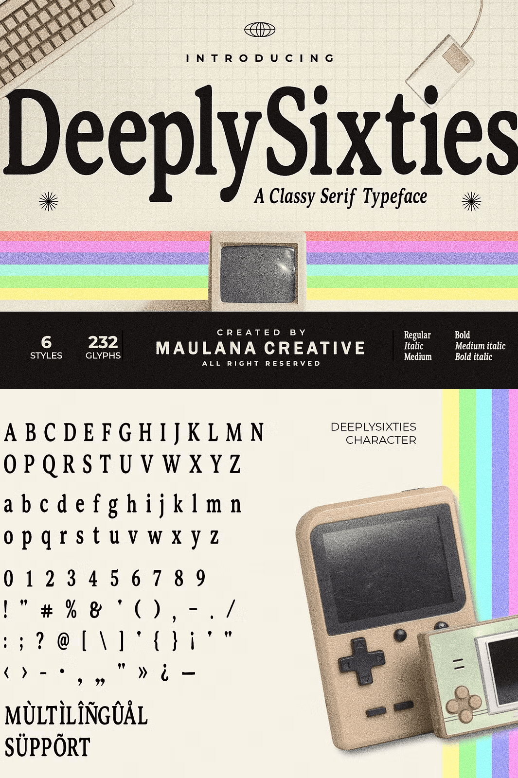
- Six complete character sets with uppercase and lowercase letters
- Numbers, punctuation, and symbols
- Multilingual support
- OTF, Web Font, and TTF formats
Every format serves a specific workflow. The OTF and TTF files install quickly on Mac and Windows for desktop design work. Meanwhile, the Web Font files are optimized for websites and digital products. As a result, one purchase covers print, desktop, and web applications.
Why Multilingual Support Matters for Editorial Design
Editorial and branding projects increasingly reach international audiences. Multilingual support ensures your typography remains consistent across languages. As a result, you avoid awkward font substitutions that break visual cohesion.
Furthermore, the extended character set handles accented letters and special symbols with ease. Consequently, your designs maintain their refined appearance in every market.
How to Use DeeplySixties in Your Projects
Start by selecting the weight that matches your hierarchy. Next, pair the Regular style with the Bold for headlines and subheadings. Then introduce the Italic styles for quotes, captions, and expressive accents.
For digital interfaces, apply the Web Font files to headers and hero sections. For print, use the OTF or TTF files to ensure crisp reproduction. Because the letterforms remain legible at all sizes, you gain remarkable typographic flexibility.
Download the DeeplySixties Retro Serif Family Today
DeeplySixties combines six versatile styles, high-contrast strokes, multilingual support, and OTF, Web Font, and TTF formats in one refined package. It gives designers, publishers, and brands everything needed to create sophisticated, timeless typography.
Download this 1960s-inspired serif font family today and bring quiet luxury, balanced proportions, and intellectual elegance to your editorial designs, magazines, book covers, and brand identity systems.