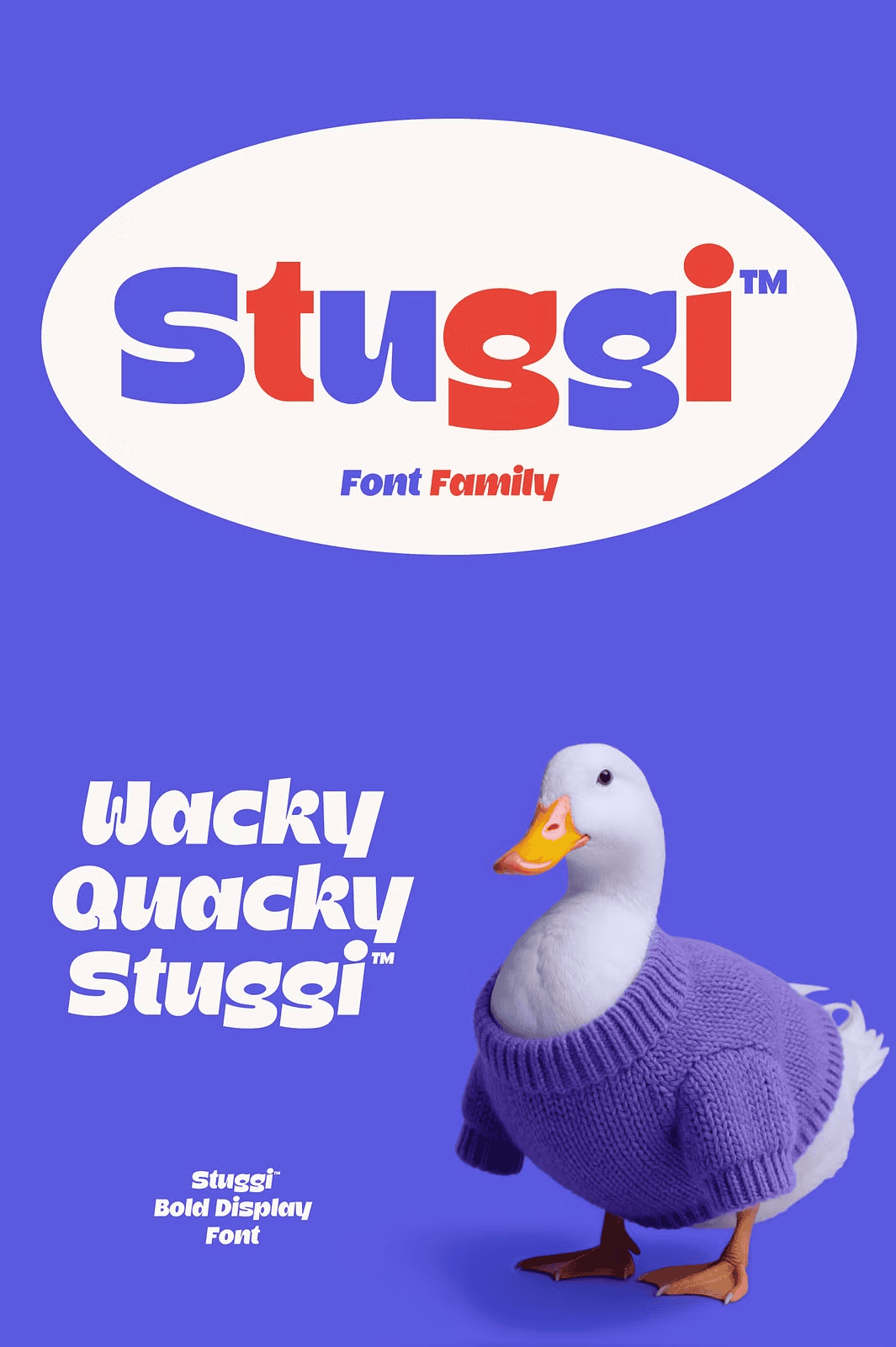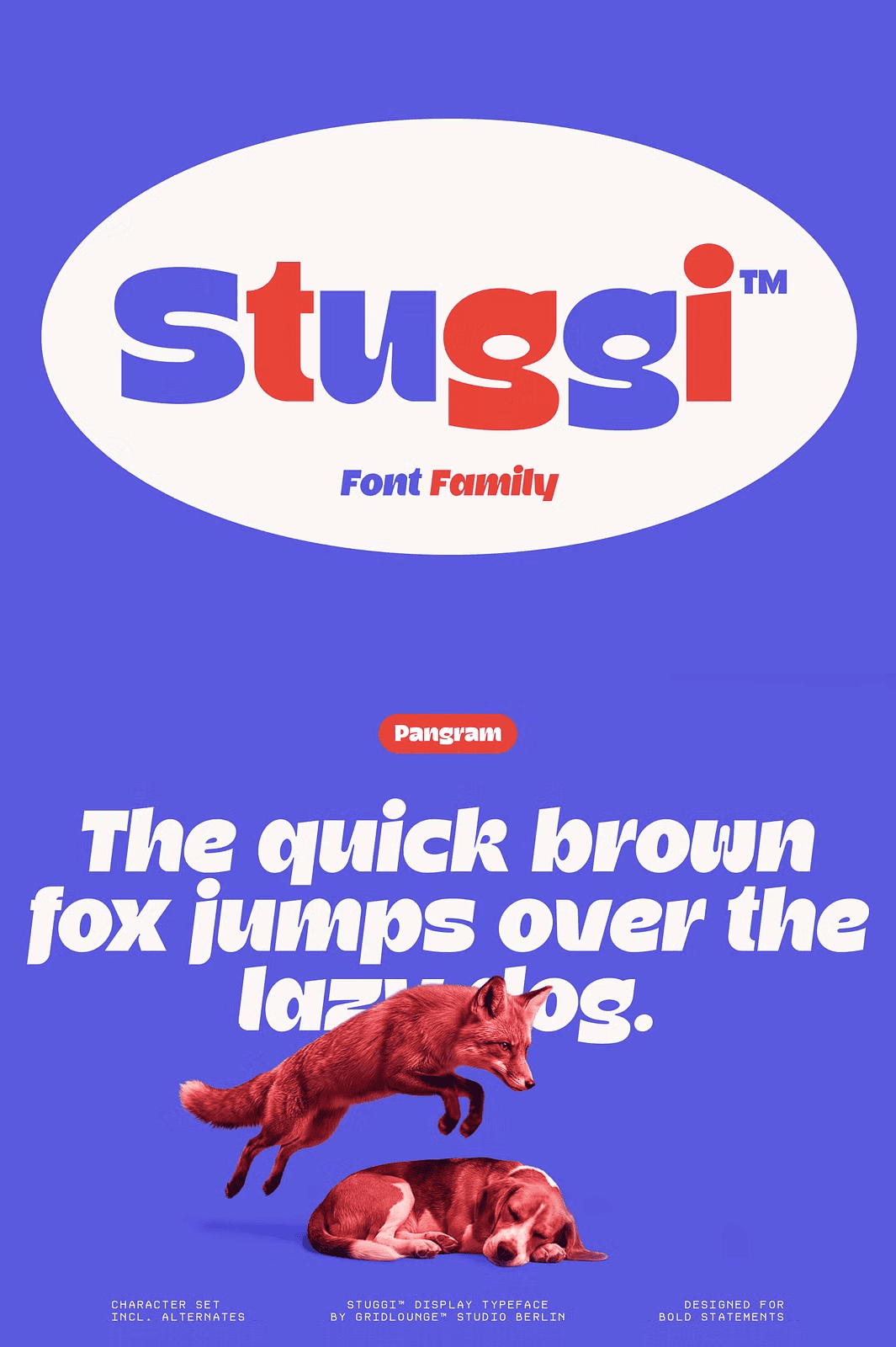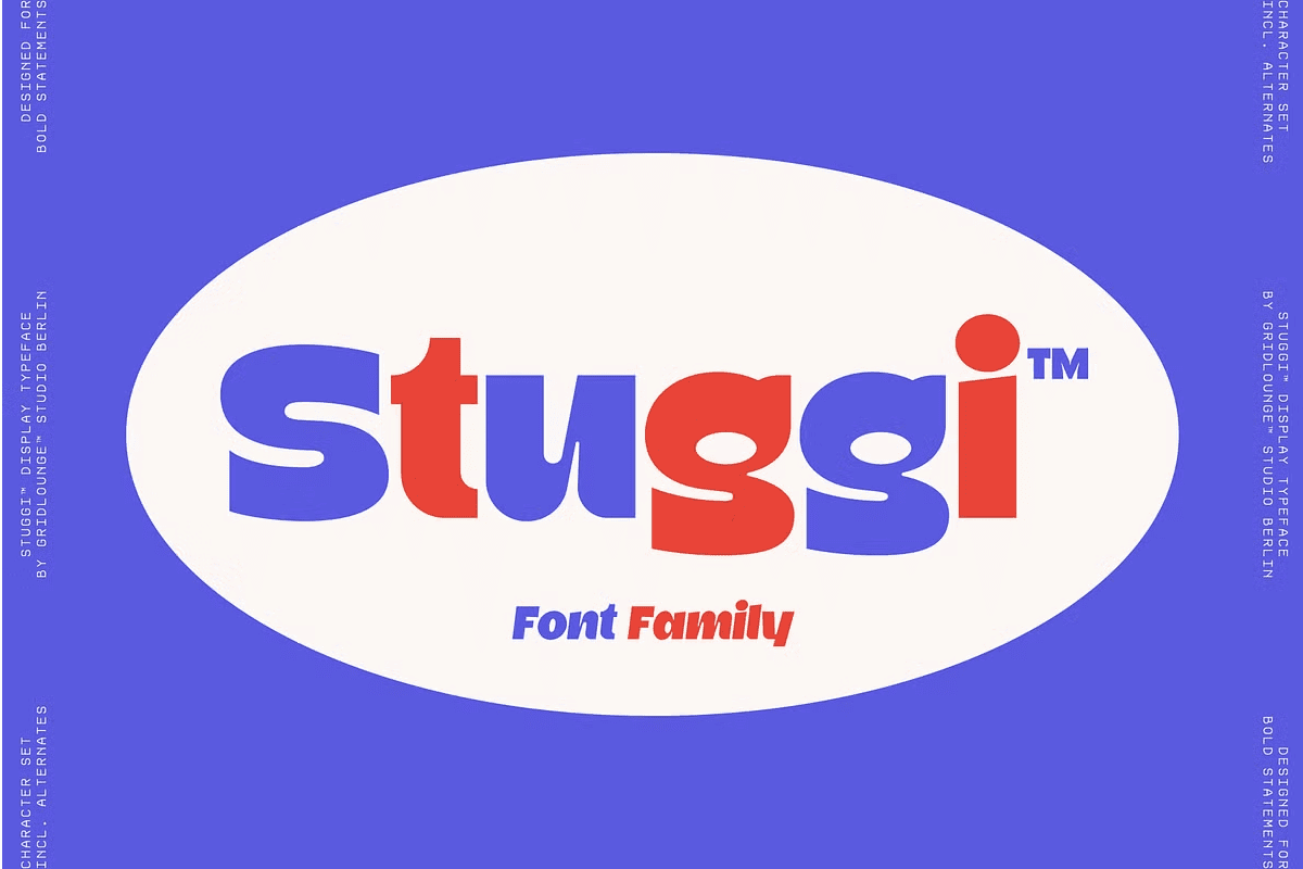

Stuggi extends into a small but expressive type system that works through contrast rather than variation for its own sake.
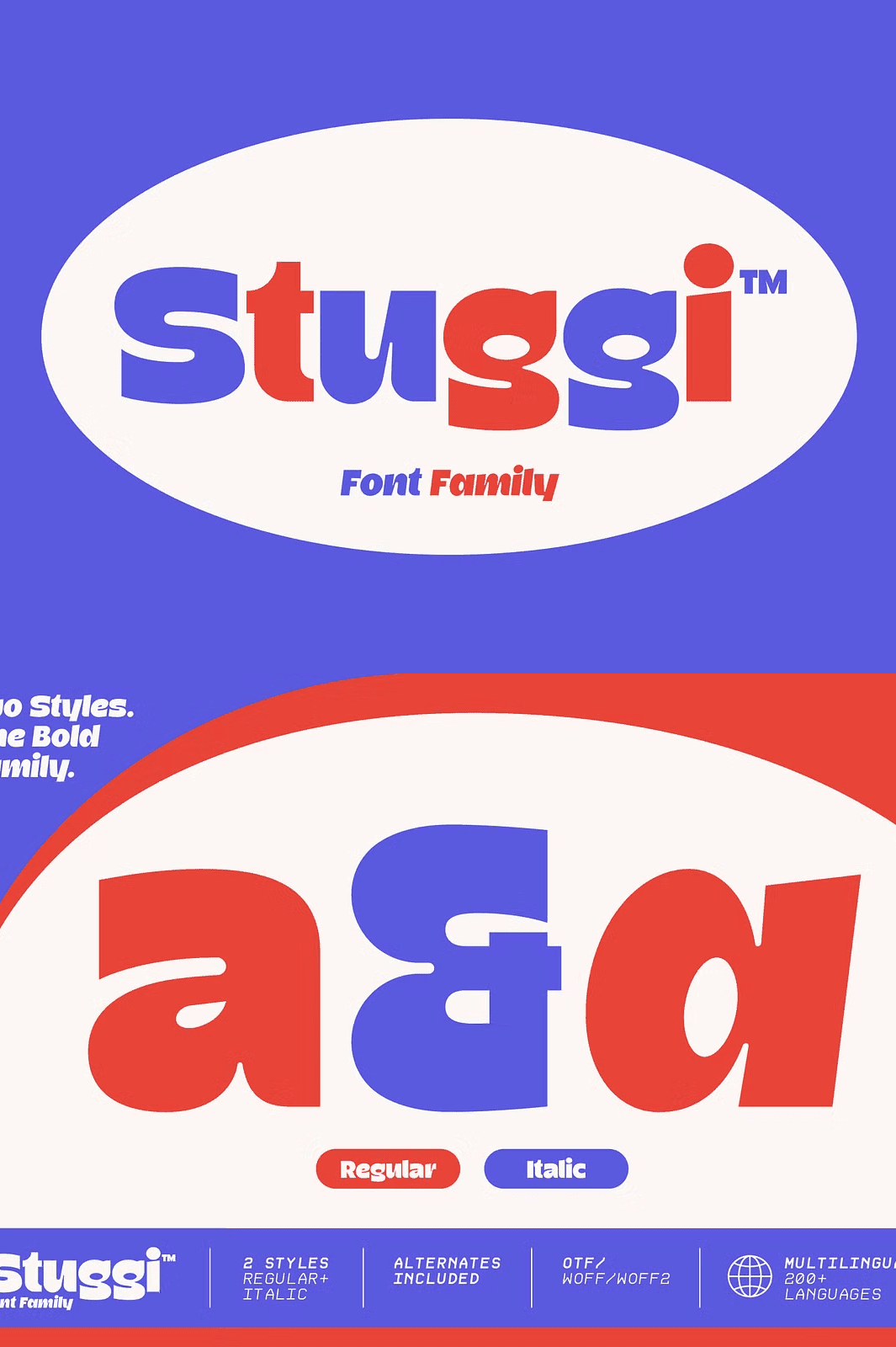
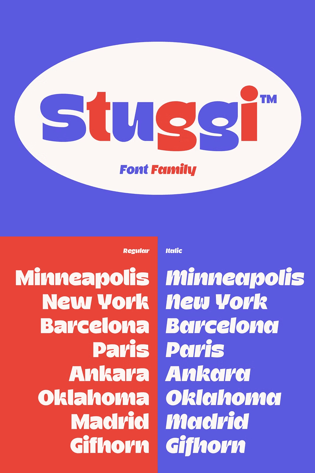
The family consists of two coordinated styles: Regular and Italic. Together they build a clear typographic relationship, one grounded and stable, the other directional and dynamic.
Why Stuggi Works as a Complete Type System
Most font families offer many weights with little purpose. Stuggi takes the opposite approach. It delivers two carefully considered styles that function as a unified system. As a result, designers gain hierarchy and energy without visual inconsistency.
Moreover, the relationship between Regular and Italic drives the entire concept. Rather than functioning as separate design choices, the two styles operate together. Consequently, typography moves between stability and motion while staying visually connected.
The Regular Cut: Structure and Confidence
The Regular cut carries the core voice of Stuggi: structured, confident, and present. It establishes clarity and gives compositions a strong typographic foundation.
Use the Regular style for headlines, body copy, navigation, and brand marks that need to feel grounded. In addition, its clean construction keeps long text readable across print and digital formats. Therefore, it anchors every layout with quiet authority.
The Italic Cut: Movement and Expression
The Italic cut shifts that voice. It introduces movement, tension, and a slightly more expressive rhythm. Used together with the Regular style, it creates hierarchy and energy within layouts without losing consistency.
Reach for the Italic style when you want emphasis, motion, or a touch of attitude. For example, apply it to pull quotes, subheadings, accent words, and dynamic poster layouts. Consequently, your designs gain visual rhythm that guides the reader’s eye.
What Is Included in the Stuggi Font Family
- Stuggi Regular
- Stuggi Italic
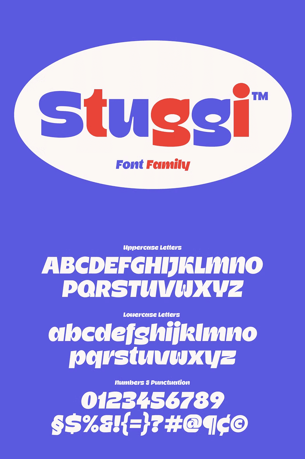
- Uppercase and lowercase characters
- Numerals and punctuation
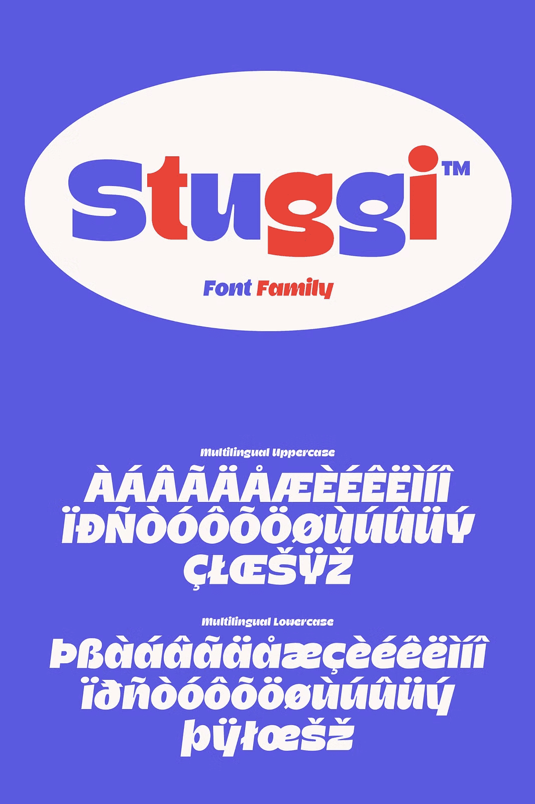
- Multilingual support
- Stylistic alternates
Every file arrives ready for immediate installation. The multilingual support lets you design for international audiences, while the stylistic alternates give you extra creative control over individual letterforms. As a result, one family covers a remarkable range of typographic needs.
Best Uses for the Stuggi Type System
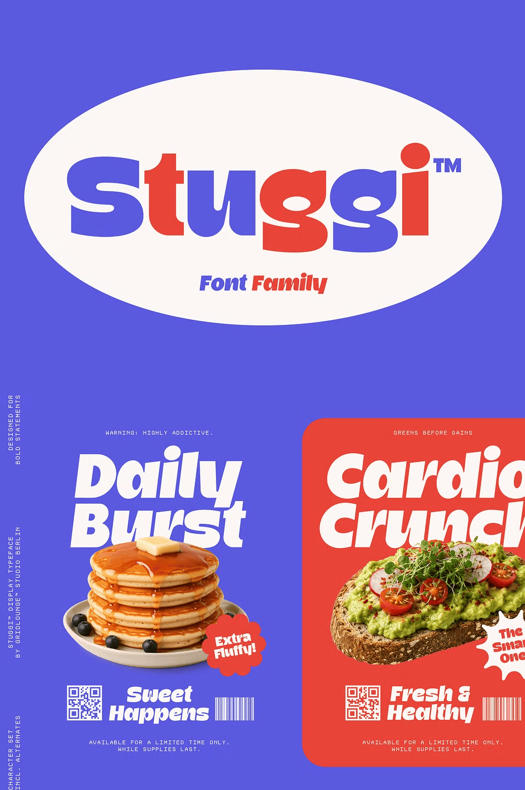
Stuggi remains rooted in contemporary urban design language, designed for work that needs presence but also control. Designers apply it to:
- Brand identities and logo systems
- Editorial design and magazine layouts
- Posters and large-format graphics
- Packaging and product labels
- Social media content and campaigns
- Typographic systems where structure and contrast work together
Whether you build a full brand identity or design a single poster, Stuggi delivers the balance of strength and flexibility your project demands. Furthermore, the contrast between Regular and Italic creates natural visual interest without extra decoration.
How to Pair Regular and Italic for Best Results
Start with the Regular style as your foundation. Next, introduce the Italic style for emphasis, rhythm, and movement. Then use both together to build clear hierarchy within headlines, subheadings, and body text.
In addition, experiment with stylistic alternates to customize individual characters. Because both styles share the same underlying structure, every combination feels intentional and cohesive. Therefore, your typography remains polished across every application.
Download Stuggi Today
Stuggi combines two coordinated styles, multilingual support, stylistic alternates, and a contemporary urban voice in one compact type system. It gives you everything needed to create expressive, controlled typography that commands attention.
Download the Stuggi Regular and Italic font family today and bring structure, movement, and modern presence to your branding, editorial, and poster projects.