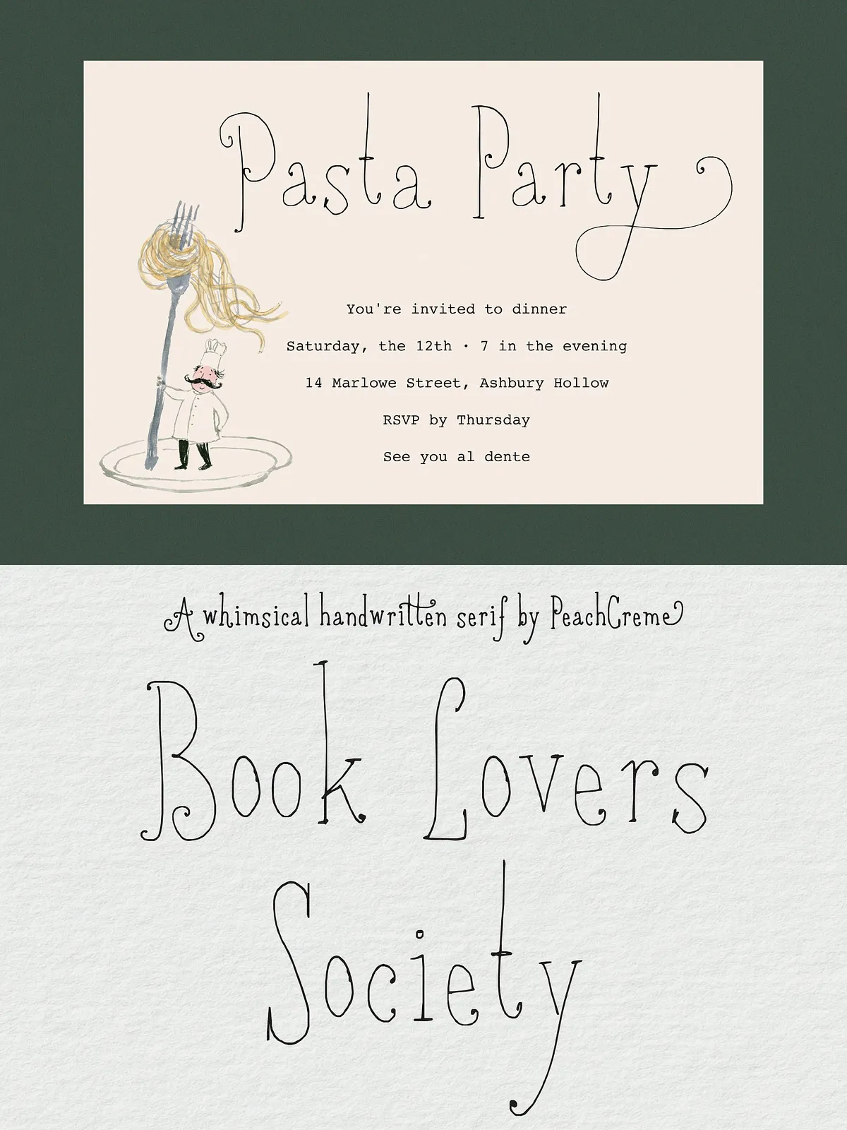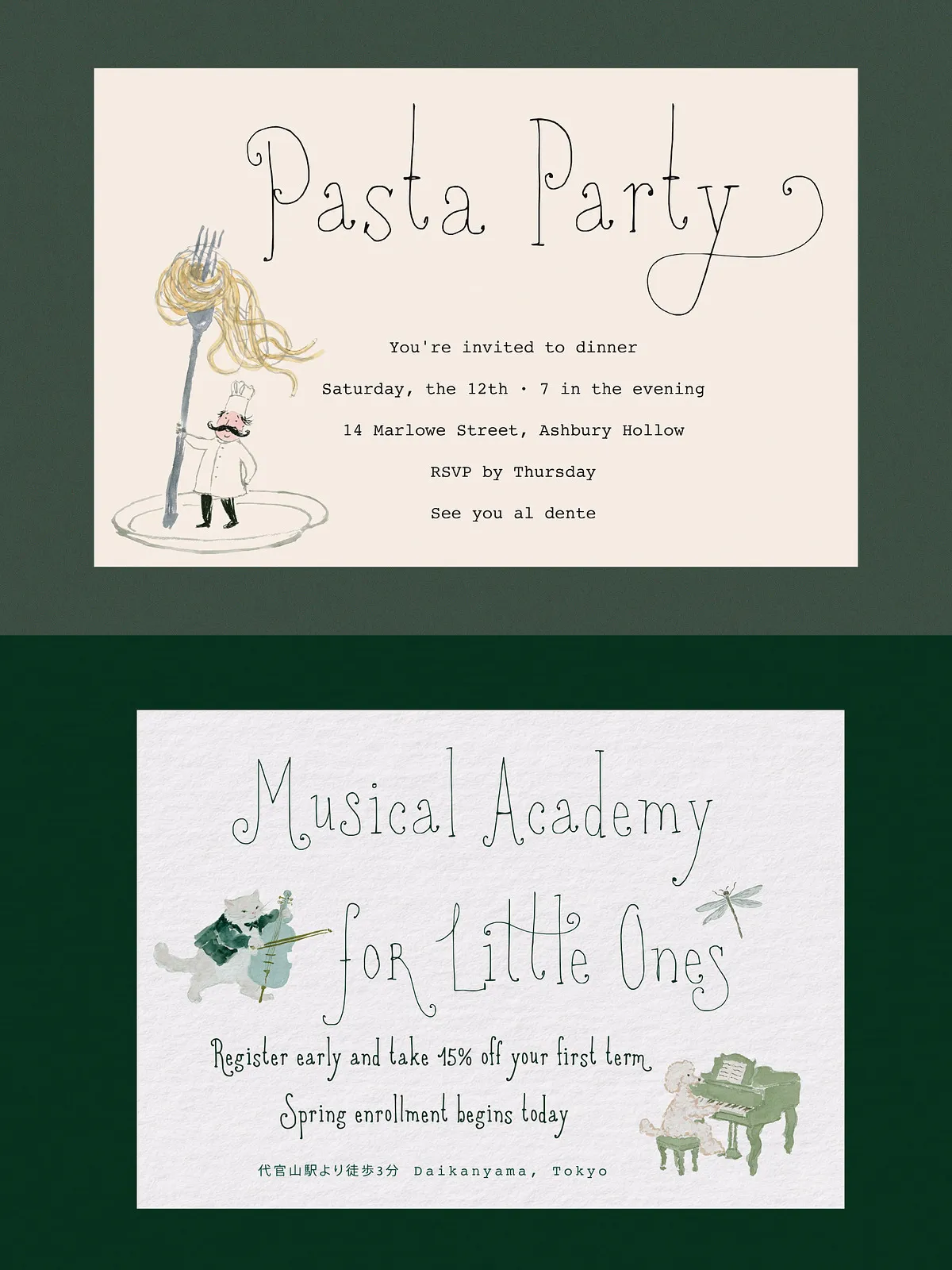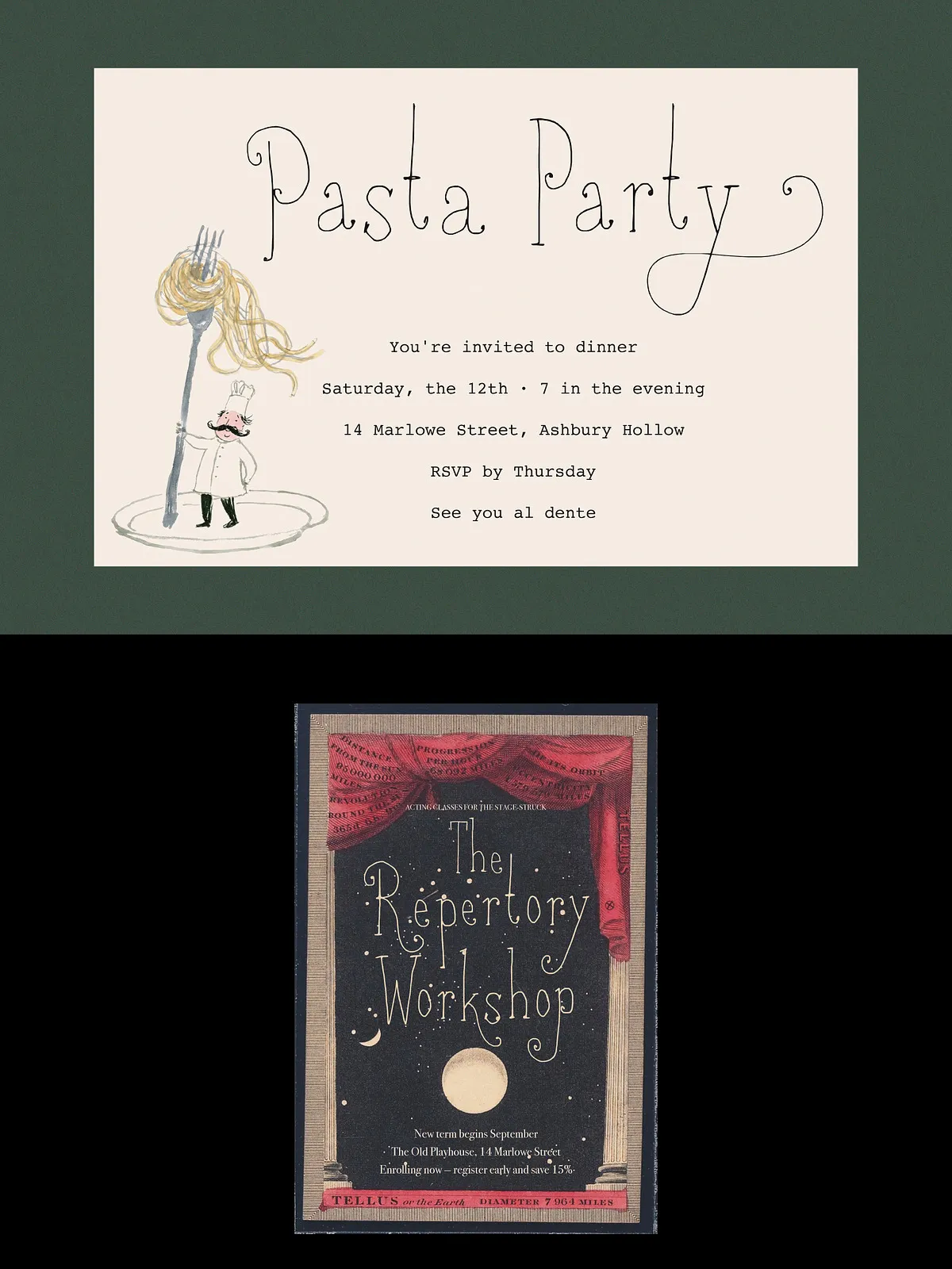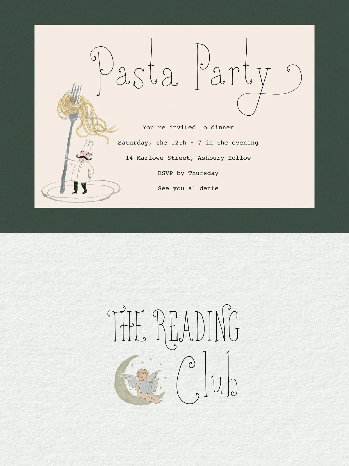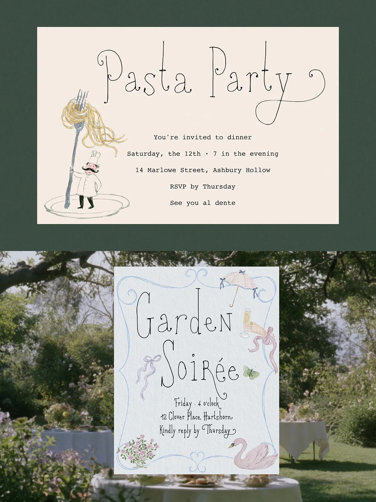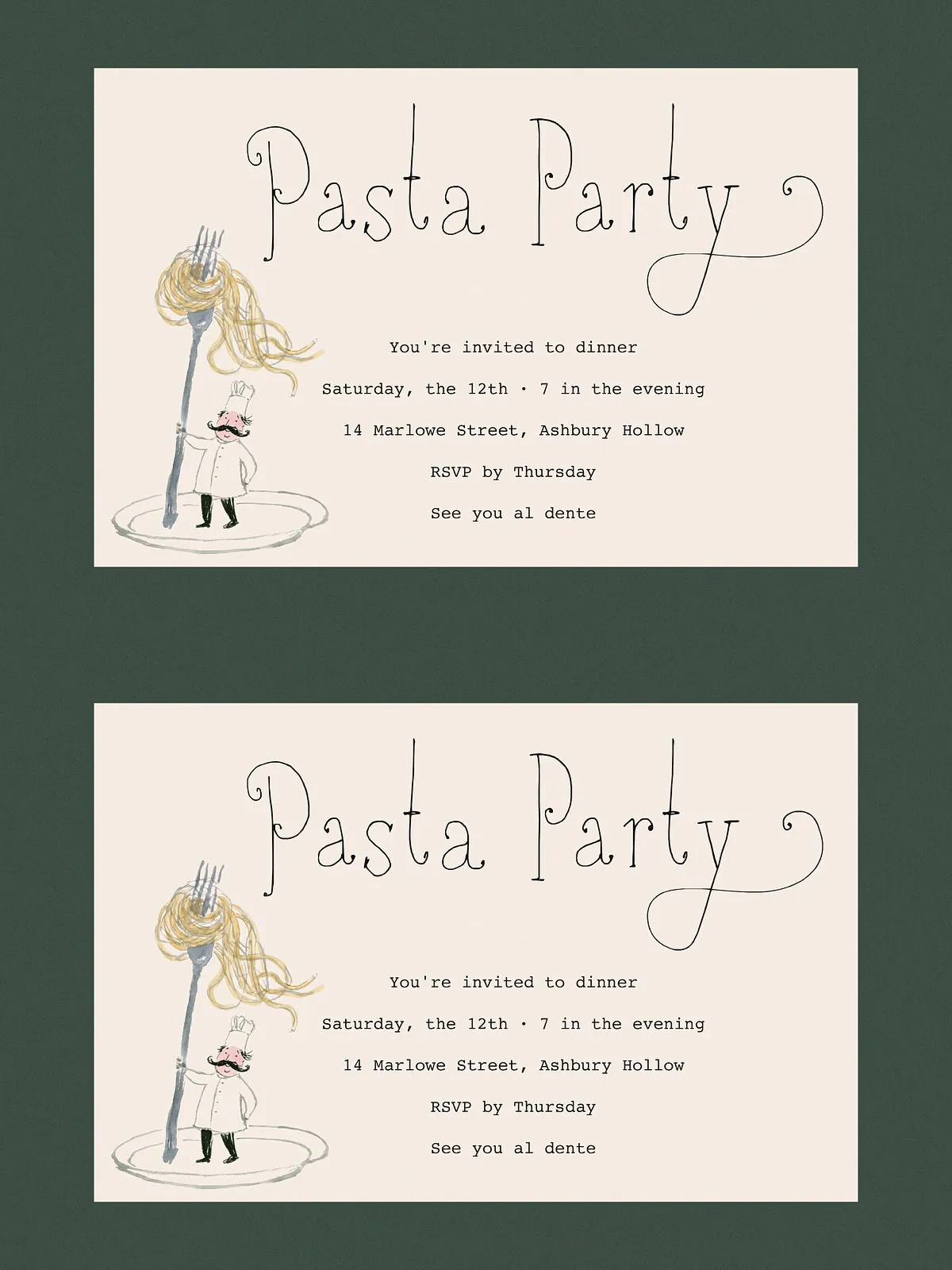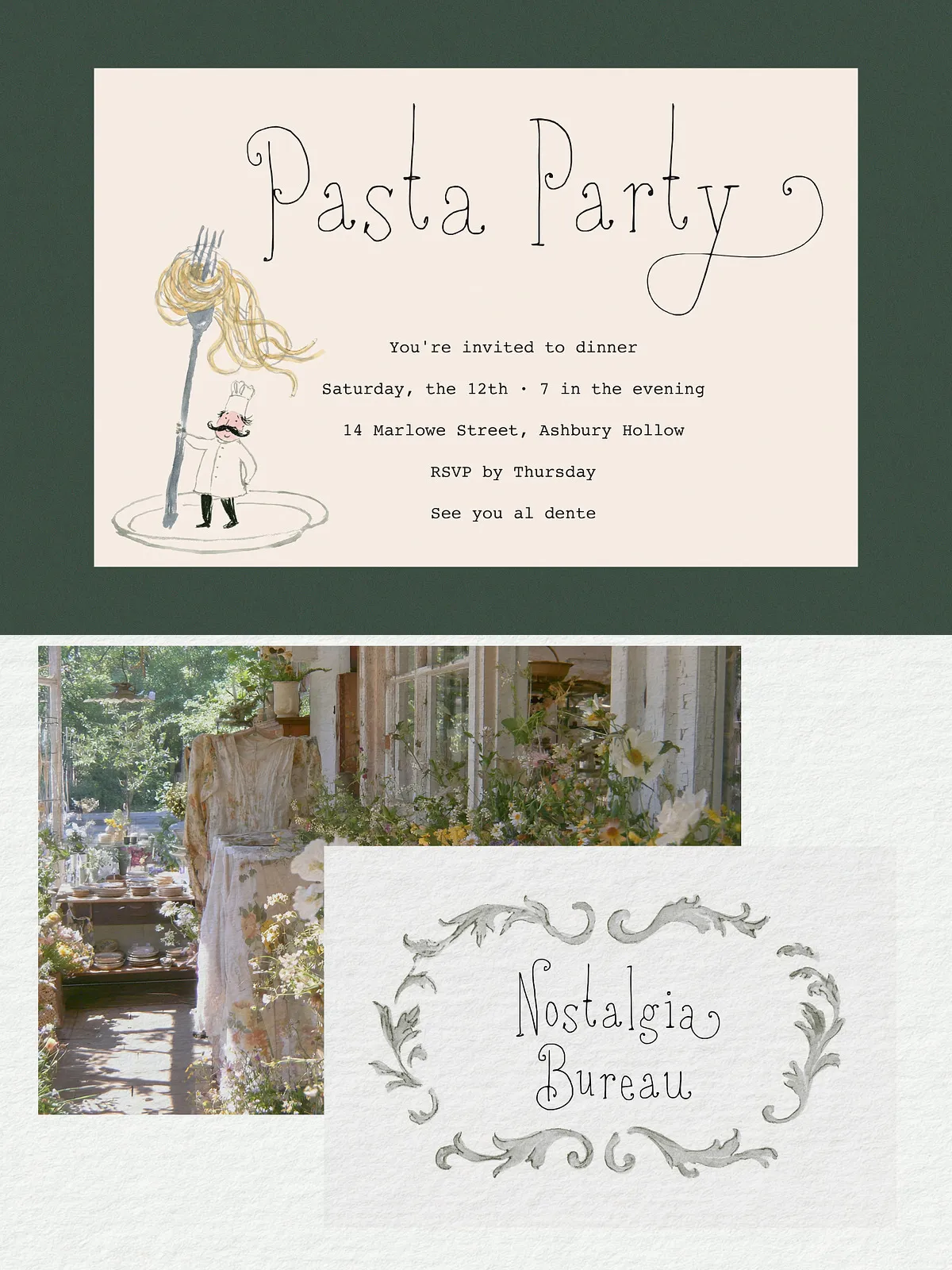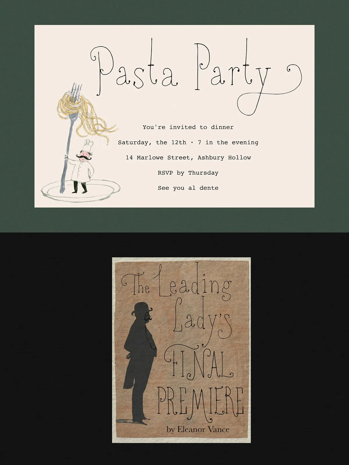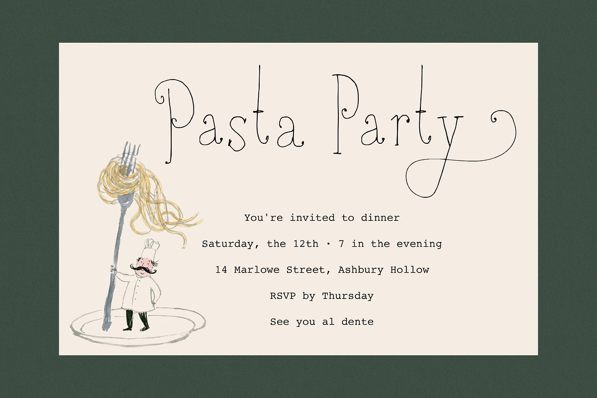

Book Lovers Society is a hand-drawn display serif with a cozy, nostalgic feel — somewhere between a classic serif and a whimsical handwriting style. Tall, delicate proportions meet an intentionally shaky, organic line, so it reads quiet and full of character at once. A gentle fit for invitations, creative branding, and storybook layouts.
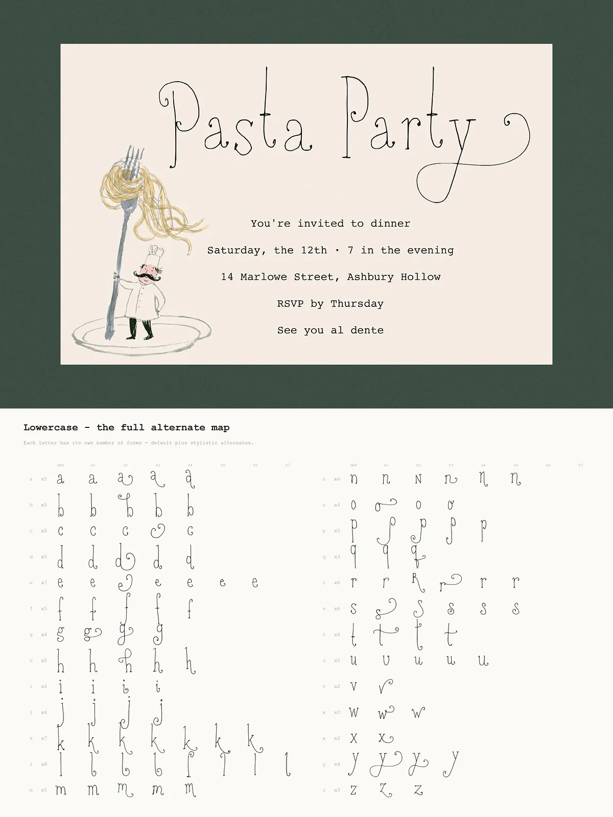
A note on the character map
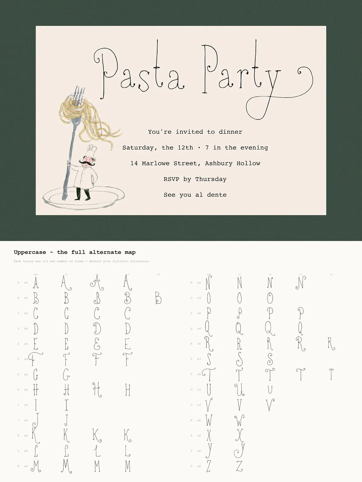
The font carries an extensive set of stylistic alternates, so your text can settle into a more varied, natural rhythm. One thing worth knowing: the alternates aren’t evenly distributed — not every letter has the same number of variations. Some characters offer a wide range of swashes and decorative forms; others stay simple and straightforward. Have a look through the preview images for the full alternate map and exactly what’s included for each letter.
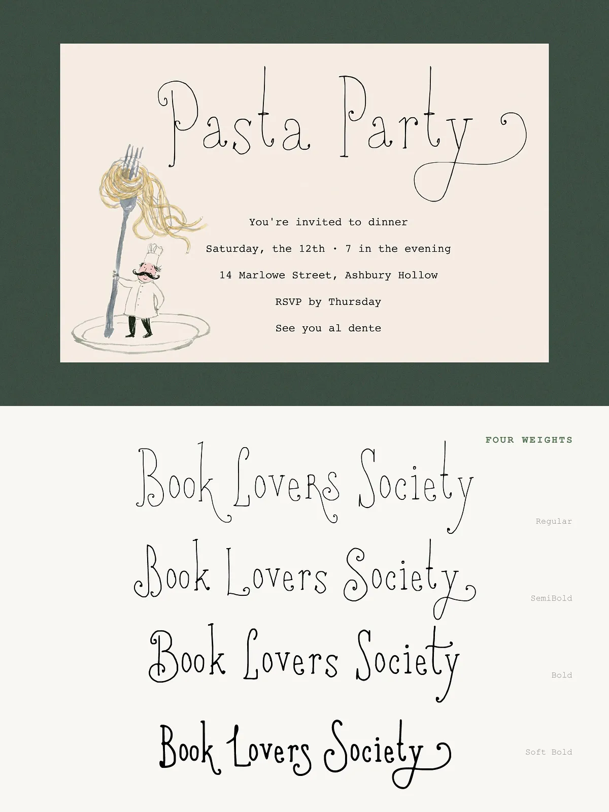
Four Weights
Regular Fine, spindly, and light — ideal for an airy, delicate feel.
Semi Bold A middle ground with a little more weight, keeping the shaky line texture intact.
Bold A classic addition that brings extra presence and visibility to the letterforms while maintaining their hand-drawn rhythm.
Soft Bold This isn’t a standard heavy bold, which can feel too harsh on a face this delicate. Instead, it is a softer, rounder, trendier bold that holds onto the organic charm and gives titles a slightly whimsical, wizard-like personality.